Pakon in Opera browser
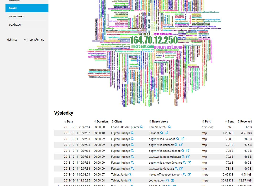
Really, I don’t like the “graphical mess” because i only takes place on the screen and is unusable. One must scroll from the filter setup to table with information…
1 Like
Don’t you like it or not? We’re testing different way how we can display results from Pakon. Any feedback regarding this is appreciated.
For me it is completely cluttered, I do not understand it, it is illegible. Chart is a chart.
I don’t like it also - It’s complete mess…
I mean, it’s pretty and all, but that doesn’t mean it conveys any meaningful information. It’s interesting to know that some domain is the most contacted domain, but not particularly useful, especially since I can’t really sort that way in the table.
The goal here is to find the most suspicious entries? Certainly, those wont be the most contacted domainnames.
I’m also not a fan of the old top 6 whatever in a circle.
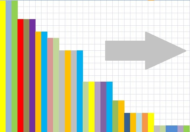
I don’t know how hard this would be, but having a table of the top, say 10, for each of the Client and Hostname and maybe Port, then when you click on the table, it expands to list more of the items with possible breakouts.
Sorting by Hostname should sort like this:
apple.com
a.apple.com
b.apple.com
c.apple.com
a.c.apple.com
I’ve actually sorted by Hostname and it’s really not sorted at all as far as I can tell.
Somebody drinks more … this is Chrismas time 
1 Like
2 Likes
Hi,
After upgrading to Turris OS version-3.11-2018-11-30 13H48 the Pakon Pie-chart is totally unreadable.
As well: the available memory decreases after each updates, this time (to v3.11) dropped from 96% available to 93%.
What I did is re-flash the router with the latest medkit and have again 97% free space, but this is quite boring as even if configuration backup has been done it is necessary to re-install various component and reconfigure via LUCI, Startup.
Hoping to get a fix for the Pakon Pie-chart.
![]()
Andrew
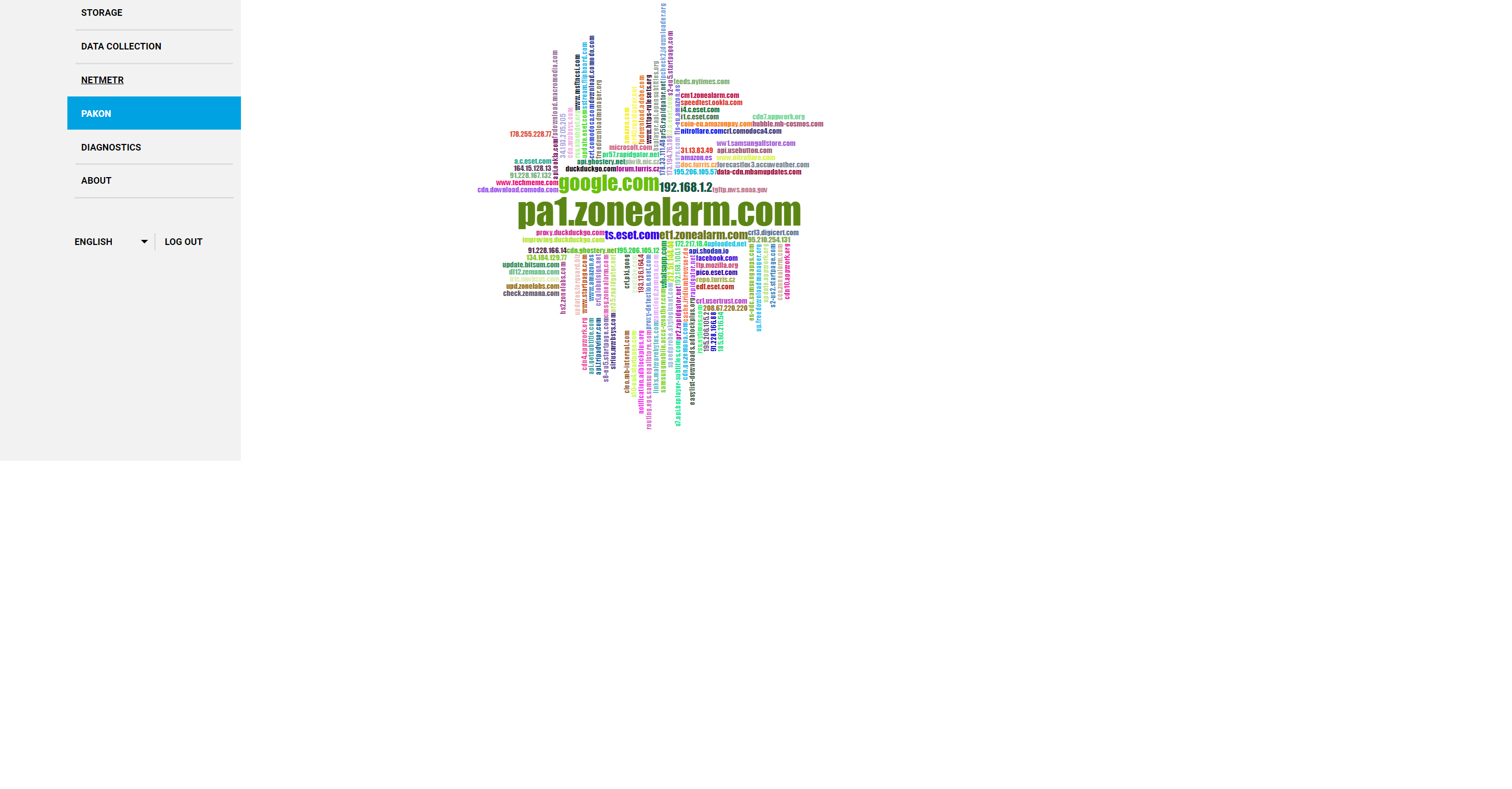
Choose to change the chart Pakon 3.11 It is not necessary to choose the type of the previous pie, it is possible to consider the type of columns. Both types of graphs are “beautiful”, you need to consider their purpose
The overview is supposed to achieve what exactly, eye candy? It just hurts the eyes and overloading the (least my pea sized) brain trying to decipher the clutter.